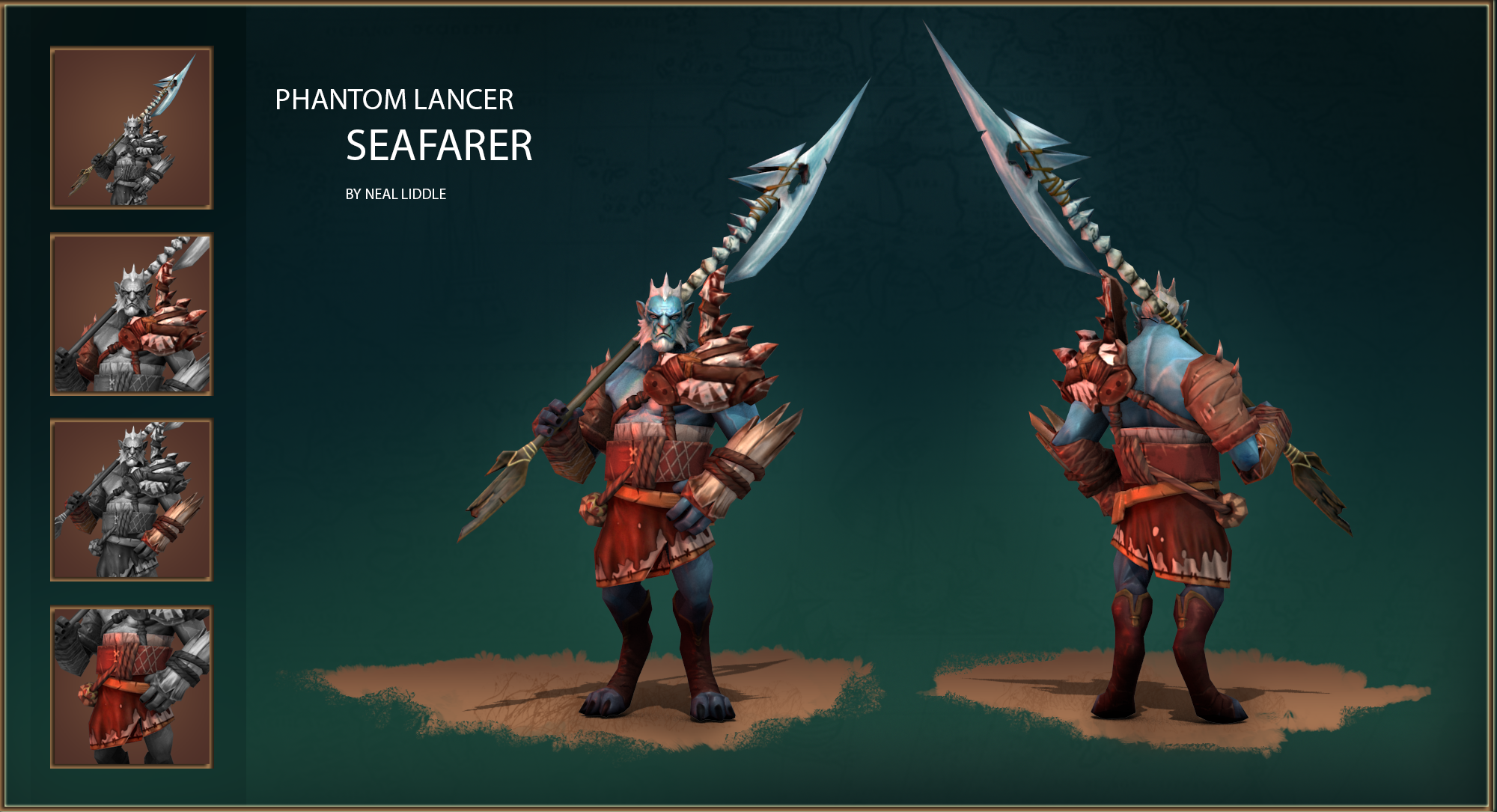
[Dota2] Phantom Lancer Seafarer
LATEST UPDATE:

I quite like the back story of this character and also the fact that he doesn't have too much to start with, allowing for more options.
I want to try play on both the characters past and his present. He's from a simple fishing village, in my case one at the shore, and don't really know the world outside of that. So his armour will be playing on his very simple knowledge of that which is around him and sometimes even a bit tribal. Most of his gear would be from thing that either washed out(shells, wood, etc) or was caught by him(fish bones etc). They will be aged/worn out at times and some might be new. Then there is the phantom side...I want to try incorporate that, make it a strength as something that might bring fear into his enemies hearts. I will probably try create this by making him a mask(which helps the tribal part) from fish bone or a fish skull. I quite like the dead/ghostly look that you get from fish skulls and feel it might work for him. With texturing I would like to play with big, bright patterns/paint marks on top of the gear.
Im not exactly sure which parts I will be doing and how many? That will become more clear when I start sifting through my reference to create the concepts.
I'll try put together a 'collage' tonight.
Replies
Did a collage with some of the parts that I would like to include. I have started on concepts for the character's armor which I'll upload later.
I think I might have to scale some parts when it comes to the character.
@Tehsplatt: I agree with you on number 6, so went with that concept but just changed it a bit to make it more practical.
@Spudnik: Thanks for the advice. I do feel that the mask does add a lot to the character and was what fueled my idea originally so will keep it in for now, unless it affects the rest of the model too much.
I've done a quick concept(left) and model(right...very rough/placeholders and still need to add some items) during lunch. Does anyone know if were allowed to go away from the original color of the clothes? Do we have to keep to the color pallet?
The weapon will come later...have some interesting ideas for it.
I've started blocking out part of the armour though. Still very WIP and might still change in proportion. I'm a bit scared that the shell might limit the arm movement so that might have to change.
Another update...
Still need some of his armour, but this is all just to block him out in 3D...
I widened his waist to give the feeling of strength. Still want to add a net around the shell...
Thanks...yea, the color is definitely helping! Still a bunch of assets to add and still have to get to the weapon. Time is running out! 80
Still have to do most of the lower half of his body...happy with his right shoulder...started working on the shell area to get that final and then on to the lower half of the body. oh, and also still have to do the other forearm shield. Then on to the weapon.
Thanks ACap. It's a good point your making. I was just talking about that to someone today. I think I'll just take it in with the test textures before going further...this is somewhat unknown territory to me so better to get it out of the way sooner than later.
I feel the shell color is a bit too busy, where his right arm's assets colors could be more contrasting(light vs dark). Will try do the left arm shield today and hopefully also get a chance to the lower part of his body tonight.
Not too happy with HIS right arm where the ropes tie around...it looks too flat. Will try figure out a way to fix that.
Also, still need to fix the shell color. Way too busy and doesn't read well at all.
The difference is not as apparent as in the latest image the spec is also a bit lower.
I have to say that the normals aren't looking as great as I was hoping(especially the ropes on his right arm), but will have to test once I've downloaded the "DOTA2 Test" which is taking forever.
Also got rid of the big rope as that was not working well with the silouette. Made the shell a bit more readable(color wise). The weapon's texture is still WIP (at the moment it's the concept 'baked' onto the weapon...)
Now for the last push...
Other than that, maybe the hunk of driftwood on the arm could use some TLC.
@naruSol & Spudnik: As requested I got rid of the mask...thanks for that! The character works much better now!!!
Well done!
Fantastic work, really looking forward for seeing that inside the game.
@cakepigdog: which image are you referring to? I need to clean up the images for the individual parts. Didn't have time and didn't know how big they need to be. Will try do that tonight, just not sure if changing the images might be seen as working after the competition?
defenetly the most original i've seen so far for this character!
beautifull details aswell, great work!
@ Gareth: Glad to see you also entered! Liking the character and the story!!
@ LuCh: Thanks!
@ Thoss: Thanks buddy! Also, thanks for all the support with the competition!